
About · CI
CORPORATE
IDENTITY
The Jeonsung symbol, names, colours and signatures — the visual language of our brand.
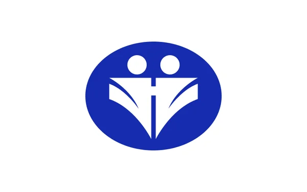
01 · Symbol
Harmony, trust and a forward-looking spirit
The circle represents harmony and unity; the blue stands for contemplation and a spirit of challenge. Together they express a hopeful, forward-looking company.
- Harmony
The circle stands for harmony and unity among people.
- Trust
Steady, honest effort that earns the trust of customers.
- Future-oriented
Blue expresses contemplation, a spirit of challenge and hope.
Rooted in our motto, the symbol conveys harmony, trust and growth through dedication and perseverance.
02 · Construction
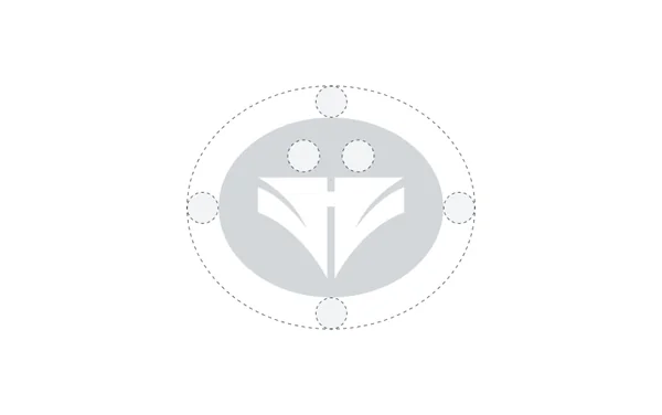
Symbol grid
The symbol is built on a fixed geometric grid. Always use the original artwork and never redraw, stretch or rearrange its elements.
- Do not change proportions
- Do not change colours
- Do not add effects or outlines
03 · Brand Name
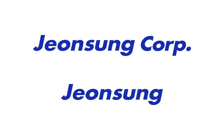
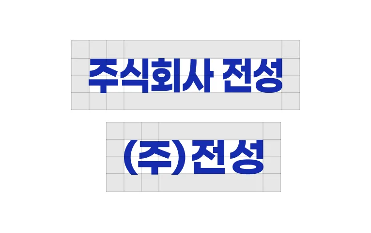
Official names
Where images can be used, the symbol and wordmark should appear together as a signature.

Clear space
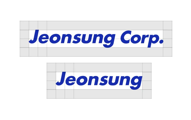
Keep a minimum clear space of half the wordmark's height on all sides so that the wordmark stands out clearly from its background.
04 · Color
Brand colours
Use blue as the primary colour. Use black on light backgrounds and white on dark backgrounds.
- HEX
- #152CAE
- RGB
- 21 · 44 · 174
- CMYK
- C100 M90 Y0 K0
On light backgrounds
On dark backgrounds
Logo on backgrounds
 Blue on white
 White on blueWhite on black
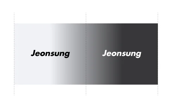
Print: minimum wordmark height 4 mm. Screen: scale for legibility on each device.
05 · Signature
Signature layouts
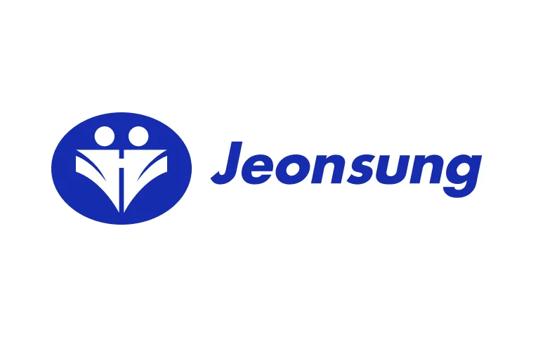
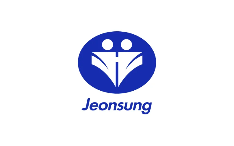
The symbol combined with the English or Korean wordmark, in horizontal and vertical layouts. Do not distort or alter the signature.
Download
CI guide files
Use the original files for any printed or digital application.