Corporate identity
Brand Name
The company’s official Korean names shall be “전성”, “(주)전성”, and “주식회사 전성”. When the use of images is possible, the symbol and wordmark shall be used in the signature format as a principle.
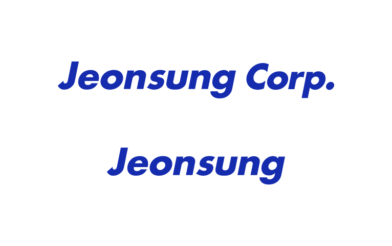
The official English names shall be “Jeonsung Corp.”, “Jeonsung”, or “JEONSUNG CO., LTD.” When the use of images is possible, the symbol and wordmark shall be used in the signature format as a principle.
Official English name

Official Korean name
Wordmark
When applying Jeonsung’s Korean or English wordmark, the following regulations must be strictly observed. Any distortion, alteration, or misuse of the wordmark is strictly prohibited.

Minimum Clear Space (English Wordmark: 1/2 of the wordmark height)
To ensure legibility and visual emphasis, a minimum clear space equivalent to half the height of the wordmark must be maintained. This space ensures sufficient contrast between the wordmark and its background.

Minimum Clear Space (Korean Wordmark: 1/2 of the wordmark height)
To ensure visibility and visual clarity, a minimum clear space equal to half the height of the wordmark must be maintained. This space helps maintain clear contrast between the wordmark and the background.
Color
Only blue, black, or white may be used for the wordmark, and the appropriate color must be selected based on the context of use.

Color Blue
Screen #152CAE
Print C100, M90, Y0, K0
Size
Screen : Appropriate sizing must be applied based on the resolution of each screen device to ensure optimal readability.
Print : The minimum size of the wordmark in print must be 4mm in height, measured from the height of the wordmark.

Usage Grayscale
The color of the wordmark must maintain sufficient contrast with the background to ensure clear visibility. Blue is the primary color; however, when necessary, white or black may be used depending on the context. Use black on light-colored backgrounds and white on dark-colored backgrounds.
Symbol
The circle symbolizes harmony and unity, while the blue color represents contemplation and a spirit of challenge.
Together, they express an image of hope and a forward-looking company.
Based on the company motto, “Empathy and Understanding” (역지사지), this design symbolically conveys harmony, trust, and continuous effort, reflecting a progressive image of growth through dedication and perseverance.


Caution
Ensure that the color of the wordmark maintains sufficient contrast with the background for clear visibility.
Minimum Clear Space
A minimum clear space is required to maintain visual emphasis. (See the image below for reference.)
Signature
The signature format combines the symbol with both the English and Korean wordmarks, arranged in horizontal and vertical layouts.
When applying the signature, all regulations must be strictly followed, and any distortion, alteration, or misuse of the form is strictly prohibited.
SignATURE English


Usage
Blue is the primary color; however, when white or black must be used depending on the situation, black should be applied on light backgrounds, and white should be applied on dark backgrounds.
SignATURE Korean


Usage
Blue is the primary color; however, when white or black must be used depending on the situation, black should be applied on light backgrounds, and white should be applied on dark backgrounds.